Monday, 9 November 2015

A Series of Terms: Exercise 2

wiggle gramAnimated images (typically gifs) that simulate a 3D effect by looping a few frames of an object shot from the vantage points of the viewer’s right and left eyes. Due to parallax, the differing wiggle speeds of the objects in the image trick the eyes into perceiving "depth" — for example, objects closer to the viewer wiggle at different speeds and transition different distances than objects farther away from the viewer. (Source)


I found that this wiggle gram was appealing by the simplicity of the movement and the easy shape of the image. This image was found on Giphy by the artist Cheezburger.


datamoshing: is the practice of intentionally using compression artifacts in digital video and animated GIFs that is sometimes to referred to as “glitch art.” Source


It is intentionally manipulating the image to distort the gif.


Source


CinemagraphCinemagraphs are still photographs in which a minor and repeated movement occurs. Cinemagraphs, which are published in either animated GIF format or as video, can give the illusion that the viewer is watching a video. (Source)  Cinemagraphs are usually taken to give the impression of real life. Cinemagraphs are usually landscaped images. Visually real and appealing


Source


stereoscopic photos: is a technique used to enable a three-dimensional effect, adding an illusion of depth to a flat image. Stereopsis, commonly (if imprecisely) known as depth perception, is the visual perception of differential distances among objects in one’s line of sight. (Source)


source


autostereogram: A stereogram is a picture within a picture. Hidden inside each image is an object which appears in 3D when viewed correctly. (source)


(source)


stereogram: a diagram or picture representing objects in a way to give the impression of   solidity. (Source)

I chose this image from 3Dimka called environmental Stereogram due to its bright colours and simplicity of shapes. 
(Source)

Wednesday, 4 November 2015

LightBox- Artist Statment

Masks, by Jessica Barch. November 2015


The trigger and starting point for this piece were the articles printed in the 2014 Contact Photo Festival catalogue: Material Self: Performing the Other Within and In Character:
Self-Portrait of the Artist.  Both articles explain how photography is a way to capture the "expanding of identity into the realm of role-playing through self-portraiture"(In Character) and the "social and cultural construction of identity" (Material Self).  When I think of self identity I think of how in social situations we put on a facade that fits that specific situation, and how in each situation that facade changes.  When constructing the image above I wanted to try and capture the idea of picking and putting on a mask and how by picking a specific mask we are choosing how we want to be perceived. 

Functioning as a self portrait I have taken a series of images of different facial expressions and edited them to look like masks. By placing them in the background of the image it works as a wall that represents the facade we put up when we interact in a social situation. The central image has a face in order to emphasize the idea of the constructed identity, public and private personas. By being the central image its focuses on the the real me and the masks I choose to portray on a daily basis. 


Wednesday, 28 October 2015

A series of Terms: Exercise 3a

alterity: othernessspecifically :  the quality or state of being radically alien to the conscious self or a particular cultural orientation. (Source)

tableau:: a view or sight that looks like a picture (Source)
                 : a scene that typically shows an event in history or literature and that is created                    on a stage by a group of people who are dressed in costumes and who do not                       speak or move (Source)
                 : a freeze frame

artifice: : dishonest or insincere behaviour or speech that is meant to deceive someone (Source)

re-enactmentreenactment is a restaging or recreation of an earlier event. (Source)
 Monalisa...Lego. Appropriation Art.:

There have been many reenactments of the Mona Lisa. This particular one was done by Malak Sarour and can be found here

Photographic Gif~ Artist Statement


When creating the photography gif I wanted to create something simplistic in nature and something that everyone can related to. The act of pouring water, and drinking it is something that we experience on a day to day basis. I used the fish bowl as a cup because it adds tension to the narrative, because it is something that is out of sequence from what is considered the normal.  As well I choose to keep the pitcher of water mostly off screen when poured and the cup out of frame when drank to create a sense of ambiguity and tension. My goal was to create a sense of mystery in such a straight forward act.

I took inspiration for the focus from Manuel Fernandez's series Recognition. Where he used a view finder to draw the eye to the object I used the pop of colour in an otherwise black and white image as a focal point.  This helped to create the air of mystery in my gif.

Tuesday, 27 October 2015

Hand drawn gif~ Artist Statement


Here it is. My first hand drawn gif.  As you can see it differed from the original idea for the project, and for this there are a few reasons.  One, the idea of the tree growing can be overdone to the point of cliche and I wasn't sure of how to ensure that my gif remained far enough away from the cliche to work with my original concept of a progression of change. The second reason being I struggled to find a way that I could make the gif seem continuous without feeling dis junked.

The goal of this gif was to create a relaxing and soothing experience for the viewer, while leaving them with the impression of a seamless viewing experience. I also wanted to have the gif portray a graphic and cartoonish quality, which with the vibrant colours, and smooth lines I have achieved.  I created the gif by hand drawing in illustrator on a Wacom tablet.  Each component of the image was created by hand which adds to the graphic quality of the image with the simplicity of the shapes used.

A series of Glitches- Making Pumpkin Patch

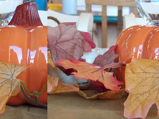
The following images are the series of glitches done to create my final glitch "Pumpkin Patch", which can be found in another blog post where I discuss my inspiration for creating the image . I've included these images so you can see the Glitch making process. The original picture was taken by me.


Original Image


Glitch #1- Added coded to the image.


Glitch #2- Added code from a different image.


Glitch #3- Nothing changed. Added additional made up code.


Glitch #4- Deleted coded. Switched back to original colour.


Glitch #5- Added code from a different image (different then glitch #2). Again changed colour.


Pumpkin Patch~ Glitch by Jessica Barch


When beginning this piece I wanted to create something that had dynamic colour and a shift of movement from the original photograph.  I drew the inspiration of colour and movement from Sabato Visconti's RGB Study #4. The original piece can be found at this link: http://www.sabatobox.com/rgb-study#4.

I also wanted to draw a connection to family and home. The original photo was taken on Thanksgiving and is the centre piece from the family table on Thanksgiving day.  I included 3 different glitches from my experiments to showcase the diverse colours I received when I added code from different images to the code of the original pumpkin photo. The purple colour is my last code experiment, the green was my 5 and the orange was my second. Overall I feel as though I've captured my original concept of family and colour.